In a large enterprise environment, I faced a classic tension between two stakeholders pulling in opposite directions on the same reporting surface. The cybersecurity risk operations team needed granular, control-level deficiency data — specific finding IDs, remediation owners, and aging metrics — while senior leadership needed high-level KPI/KRI trend summaries to inform governance decisions.
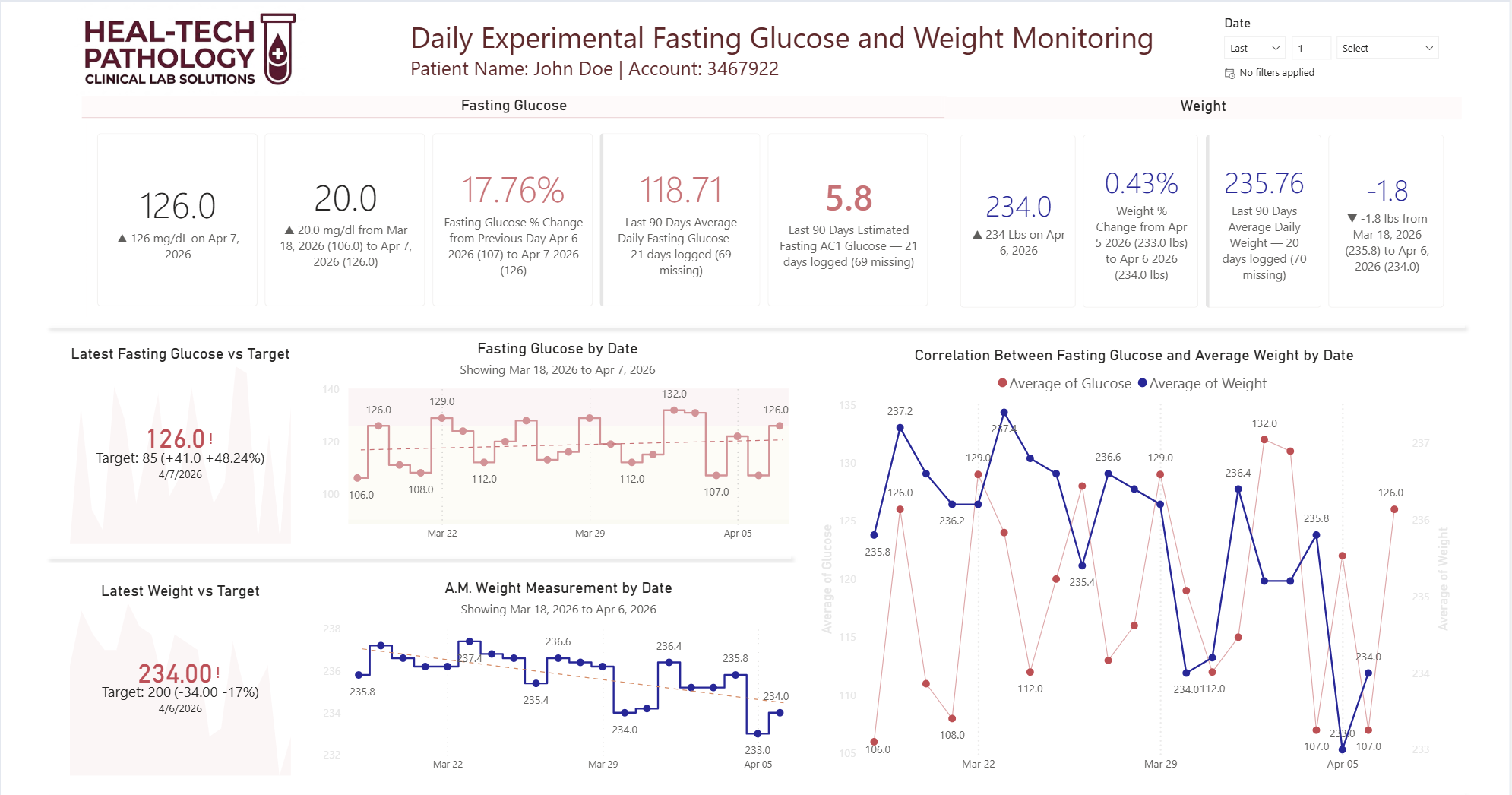
The path of least resistance would have been to build each team their own dedicated dashboard. But that approach carries a compounding cost — duplicate data models, divergent definitions, parallel maintenance cycles, and eventually two versions of the truth that quietly drift apart. Instead, I reframed the problem architecturally. I built a single unified semantic model in Power BI — one governed data layer — and separated only the presentation into two lightweight reporting canvases — each tailored to its audience's decision context, but both designed so that any high-level visual could be interrogated deeper, allowing users to navigate from summary indicators down to the underlying granular records without ever leaving the report. The executive canvas exposed trend lines, threshold indicators, and period-over-period risk posture. The operational canvas surfaced the remediation queue, control owner assignments, and aging breakdowns.
The connective layer between them was deliberate: I implemented drillthrough actions on the executive-level visuals so that any flagged KRI — say, a spike in open high-severity findings — could be drilled through directly into the operational detail behind that signal. No context switching, no separate report to open, no data reconciliation question. The executive sees the signal; the analyst can immediately navigate to the source records driving it. I also used drilldown hierarchies within certain visuals — for example, a risk category summary that could be expanded from domain → control family → individual finding — so the level of granularity was user-controlled rather than hardcoded into a single view.
For cases requiring deeper investigation beyond what the dashboard surface could reasonably present, I embedded direct hyperlinks from individual records to their corresponding entries in the system of record — giving analysts a single click path to the authoritative source without leaving their workflow. I also enabled scoped data exports to Excel at the visual level, so operational team members could pull filtered subsets for ad hoc analysis, audit documentation, or offline review without needing direct database access or a separate data request.
The result was a reporting architecture that satisfied both audiences without doubling the maintenance burden — executive-ready at the surface, operationally deep on demand, and connected all the way back to the system of record when the analysis needed to go further.