Core Roles & Functional Titles
Data Analyst, Business Intelligence (BI) Engineer, BI Architect, Analytics Engineer, Data Visualization Specialist, Reporting Analyst, Data Solutions Architect, Enterprise BI Developer, Data Platform Engineer, Decision Support Analyst
Microsoft Fabric & Power BI Ecosystem
Microsoft Fabric Core, Microsoft Fabric, Fabric Data Warehouse, Fabric Lakehouse, OneLake, Fabric Pipelines, Dataflows Gen2, Direct Lake Mode, Workspace Management, Deployment Pipelines, Fabric Capacity (F-SKU), Notebooks (Fabric / Synapse integration)
Power BI Core, Microsoft Power BI, Power BI Desktop, Power BI Service, Power BI Premium, Power BI Report Builder, Paginated Reports, Semantic Models, Power BI Dataset, Composite Models, DAX, Data Analysis Expressions, Power Query, M Language, Row-Level Security, RLS, Object-Level Security, OLS, Incremental Refresh
AI, Fabric Data Agent & Conversational BI
Fabric Data Agent, Microsoft Fabric Data Agent, AI Data Agent (Fabric), Conversational BI, Natural Language Query, NLQ, Natural Language Data Access, Copilot for Analytics, AI-Powered Analytics, Prompt-Based Data Exploration, Semantic AI Query Layer, Data Copilot Experience
AI-enabled Fabric Data Agent, Governed Fabric Data Agent, Semantic Model–driven Data Agent, Self-service Data Agent (Fabric), Enterprise Data Agent for BI, AI-assisted Data Exploration Layer
Data Modeling & Architecture
Data Modeling, Star Schema Design, Snowflake Schema, Dimensional Modeling, Data Vault Concepts, Medallion Architecture, Bronze / Silver / Gold, Data Lakehouse Architecture, Enterprise Data Architecture, Semantic Layer Design, Business Logic Layering, Fact & Dimension Modeling, Aggregation Tables
Data Engineering & Integration
ETL / ELT Pipelines, Data Ingestion Pipelines, Data Transformation, Data Orchestration, Data Integration, Azure Data Factory, REST API Integration, SQL Development, T-SQL, Stored Procedures, Data Wrangling, Data Cleaning & Preparation, Query Folding, Incremental Data Processing
Azure & Cloud Data Stack
Microsoft Azure, Azure Synapse Analytics, Azure Data Lake Storage, ADLS Gen2, Azure SQL Database, Azure Analysis Services, Microsoft Entra ID, Azure AD, Cloud Data Platforms, Hybrid Data Architecture, Serverless Data Architecture, Scalable Cloud Analytics
Performance Optimization & Advanced BI
DAX Optimization, Query Performance Tuning, VertiPaq Engine Optimization, Data Model Optimization, Aggregations Strategy, Partitioning Strategy, Columnar Compression, Memory Optimization, Query Reduction Techniques, Performance Monitoring
Governance, Security & Enterprise Control
Data Governance, Data Quality Management, Data Lineage, Metadata Management, Role-Based Access Control, RBAC, Row-Level Security, RLS, Object-Level Security, OLS, Data Privacy Compliance, GDPR, HIPAA, Enterprise Security Architecture, Trusted Semantic Layer, Governed Analytics Ecosystem, Secure Self-Service BI
Reporting, Visualization & UX
Interactive Dashboards, Executive Reporting, KPI Development & Tracking, Drill-down / Drill-through Analysis, Data Storytelling, UX for Analytics, Visual Analytics, Ad-hoc Reporting, Paginated Reports, Mobile-optimized Dashboards, Insight-driven Dashboards, Self-service Reporting
Business & Stakeholder Skills
Requirements Gathering, Stakeholder Management, Business Process Analysis, Cross-functional Collaboration, Agile / Scrum Methodologies, Data-driven Decision Making, Translating Business Requirements into Technical Solutions, KPI Definition with Business Stakeholders, Strategic Analytics Support, Executive Communication
Data Strategy & Advanced Concepts
Data Product Development, Analytics Strategy, Data Democratization, Self-Service Analytics Enablement, Real-time Analytics, Streaming Data Analytics, Event-driven Architecture, Predictive Analytics, Machine Learning Integration in BI, AI-Augmented Decision Systems, Data Mesh Concepts, Data Fabric Architecture
Programming & Technical Skills
SQL, T-SQL, ANSI SQL, Python for Data Analytics, R for Statistical Analysis, DAX, Advanced Calculations, M Language, Power Query, API Development & Consumption, Git / Version Control, Notebook-based Analytics
Certifications
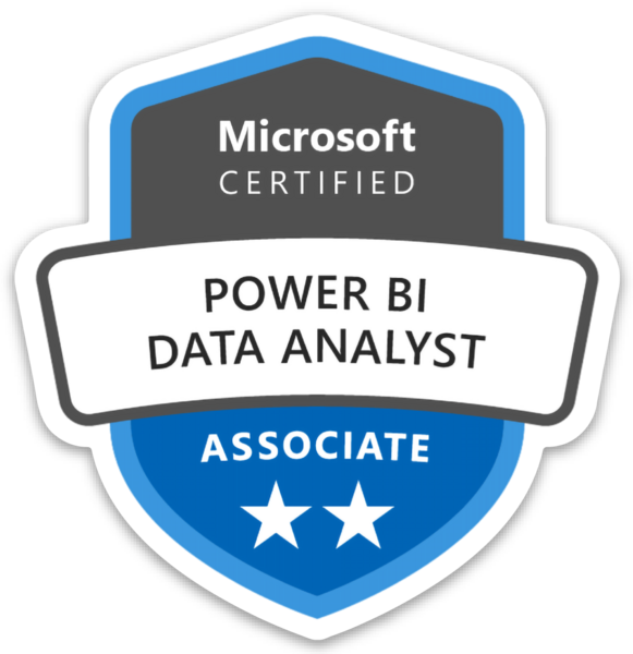
Microsoft Certified: Power BI Data Analyst Associate, Microsoft Certified: Fabric Analytics Engineer Associate, Microsoft Certified: Azure Data Engineer Associate, Microsoft Certified: Azure Solutions Architect Expert, Microsoft Certified: Data Analyst Associate